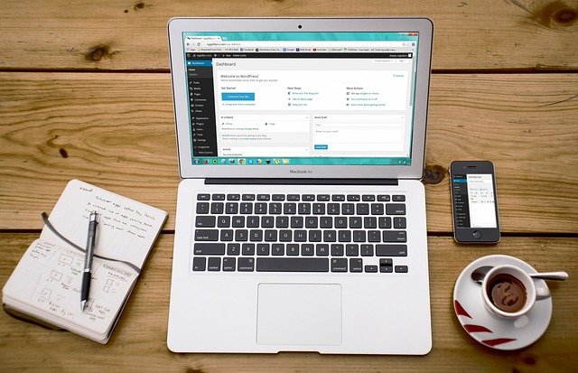
Web design is a constantly evolving field, and trends that were big yesterday won’t stick around forever. Just find a website that was designed in 2010 and you’ll see what we mean. And then, going back to 2000, the difference will be even more drastic. A designer needs to stay aware of what’s currently hot and how the trends are shifting, and always remain on top of these movements. No, you don’t have to incorporate every little thing you come across, but there are some points that are important to understand properly nowadays.
Vibrant Is Back in Style
Color trends come and go, and right now, betting on bright and vibrant schemes is a pretty safe move. We’re moving away from the flat, dull colors that dominated designs not too long ago, and people are also starting to return to the use of a variety of shapes, rather than making everything square. That last one is a particularly important trend to follow, as you can achieve a lot with the clever use of more rounded shapes throughout your designs. Combine that with some good animations (more on that below), and you’re golden!
If you’re short on ideas, just look through some designer communities and you’ll see these trends everywhere. Pick a few designs that look like they can work as a base for your own creations nicely, and try to introduce some creative modifications to them. Remember, don’t try to start from scratch unless you have a really good idea – hiding your sources of inspiration well enough is part of being creative, after all.
Responsive Design Is a Must
Many people now expect responsive designs by default, and if you’re not serving them properly, you’re going to have a large number of disappointed visitors. Even worse, you might see a lot of traffic irregularities, and it will be hard to pinpoint the reason if you don’t pay attention to the responsiveness of your pages. You might spend a lot of time and energy trying to resolve the issue by changing your content and other elements of the site, when it could be as simple as making sure that it works well across all kinds of resolutions.
This includes even smaller ones – you can’t discard people who browse in windowed mode in a small-sized window these days. There are many ways to surf the Web, and assuming that yours is the only sensible one is one of the fastest ways to kill the potential of any design you come up with!
You Can’t Ignore Mobile Anymore
It’s 2018. If your site is still not suitable for a mobile browsing experience, you’re doomed from the start. The number of people surfing the Web on their phones and tablets is not negligible in any way these days, and they are a very important market that many fail to seize until it’s too late. There aren’t many difficulties in implementing a proper mobile design if you’re following good responsiveness practices as we described above, and you usually only need to do a few additional adjustments to ensure that things work well on smartphones.
You also shouldn’t need to test on too many different devices, as the fact that most users are using one of two operating systems means that this is one of the few main factors that you need to test for. Resolution is another one, but other than that, it should be relatively easy to ensure that your site runs properly on the majority of devices on the market right now.
A Proper Host Matters More Than Ever
This is not something most web designers consider initially, but knowing how to find a good host for your projects is more important than ever before. Web hosting has evolved alongside web design and development themselves, and it’s now a very diverse field with a number of different offers that you can explore. You have to make sure that you’re getting a good bang for your buck, especially if your site has more specialized requirements, such as a specific scripting language, database access, or more.
Things get even messier if you’re planning to deploy a very content-intensive website, in which case you should look into Content Delivery Networks (CDNs). They can allow you to optimize the traffic and load of your website significantly better than traditional hosting solutions, and while they can be a bit costlier in the long run, the price is well justified by the benefits this service brings to the table.
Animations Make Everything More Intuitive
Last but not least, if you still don’t have any animating skills, now is the time to start working on them. You don’t need to be a professional animator to understand some basic concepts, like easing in/easing out, flow, transitions, and so on. The Web is now in a state where devices can comfortably display such animations, which means that you should do your best to take advantage of them. When used appropriately, animations can add a lot to the experience of navigating a website.
Their point, contrary to common misconception, is not primarily to make your site look prettier, although they do contribute to that as well. Using animations is more about gently nudging the user in the right direction, allowing them to smoothly transition from one page to another without even having to think about it. While you can do that without animations too, it takes more effort, and they’re a much more flexible tool when it comes to prompting the user to take certain actions.
If you think that maintaining knowledge of these trends is too much, you don’t have to actively seek out these new developments on a daily basis. It’s enough to subscribe to a few relevant communities and keep an eye on them every once in a while. But then again, if this is your primary job and your future career, it’s definitely in your best interest to spend as much time as you can researching new technologies and educating yourself on how the web design field is shifting.