
How to create a SaaS homepage that converts?
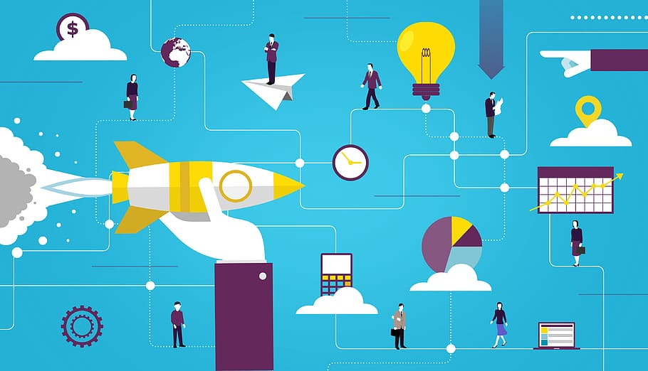
by Josh Biggs in Business, Software on 16th February 2021SaaS website design is a great sales funnel model. There are many factors to consider, ranging from the placement of blocks on the page to the correct calls to buy. In addition to clean design and easy navigation, animation plays an important role. It guides the user and guides him along the desired route. But that’s not all. In this article, you’ll discover a few important areas where designers and marketers often make mistakes. This prevents the SaaS web design model from fully expanding, and it prevents you from getting the maximum conversion.
Clear offer
Best SaaS website designs are sure to cater to the needs of the audience. It doesn’t matter how complex your production or field of activity is, your potential customers should understand everything that you do. This is the main difficulty of creating industrial website designs. The specialist must package the product or service so that the untrained reader understands what is at stake.
Value proposition in the headline and sub-headline
Many companies do not give the homepage lead magnet the attention it deserves. They miss out on the opportunity to educate potential customers in the middle of the funnel in more detail. Also be sure to consider the price range for your product or service. If more than 80% of the population of your country can afford to purchase your product, then you can immediately lead the page guests to purchase. If fewer than 50% or less of the people are potential buyers, you must prepare your target audience. Introduce your readers to the product better:
• Offer a free guide to use;
• Stay up to date with a series of articles in your expert blog;
• Offer several options for using the product;
• Tell us about related services that will improve the client’s life even more;
• Be sure to offer a trial period and a gift for your purchase.
Clear call-to-action
On this page, SaaS companies should clearly state who their software is for. Namely, list specific roles, positions or persons (the more specific, the better). By specifying only general verticals or sections (for example, Healthcare, Construction, Lending), you work with everyone and at the same time with no one. A person who is looking for a solution to his problem is more likely to pay attention to narrower specifics that apply personally to him.
Hierarchy-based top page navigation
By posting a regular subscription form in the blog header, companies are wasting valuable space on their site. As a rule, the conversion for these forms is minimal and most often does not exceed 0.5%. A well-chosen downloadable lead magnet helps you get better results. You just need to embed a template or guide that suits your target audience. The conversion in this case is already 1-5%.
The main content of every blog post must have a CTA element. It is imperative to make an internal linking to articles relevant to the topic. It will also be useful to place links to important sections of the site in the texts. It will help your SEO and direct users to feature, benefit and business case pages.
Contact numbers, Live Chat and inquiry forms
Many people are shy or unable to call during their work hours. You will greatly simplify the lives of your potential customers if you add chatbots to your site. They help readers quickly access the information they need. Ideal if you can place an order directly through the bot.
Be careful with pop-ups. This is a useful feature, but if the window covers important content or appears too often, users get annoyed. Registration forms are a very important part of the SaaS scheme. If the form includes only 1-2 steps, then people will be happy to try the demo version or subscribe to the newsletter.